Making sense of the inverted yield curve
The countdown may have started for an economic slowdown.
The U.S. Treasury yield curve is often a signal of future economic activity. It is intuitive to expect a higher rate of return for longer investment horizons than shorter ones. Hence a normal yield curve is one where yields are lower for shorter maturities than longer maturities, a so-called positive sloping yield curve.
Occasionally, we see a different shape to the yield curve – a flat curve when economic activity and inflation are expected to be stable or a negative slope such as we have now. This negative slope, with short-term rates higher than long-term, is also called an inverted yield curve and is an unusual occurrence.
When short rates are higher than long-term rates, the message from the treasury market is an expectation of slower growth in the future. Investors are willing to accept a lesser long-term rate to avoid having bonds mature when interest rates are expected to be lower.
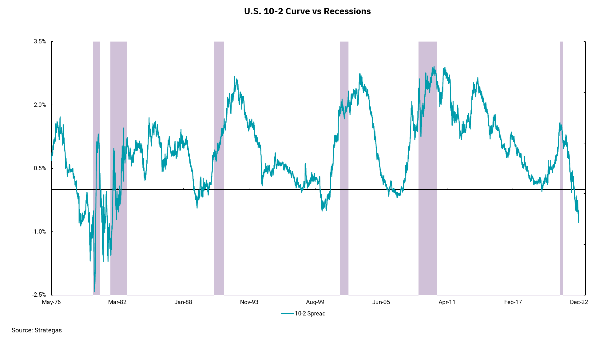
This week's chart shows the difference in yield between the two-year treasury note and the ten-year treasury note going back to 1976. The extreme variability of the yield curve in the late 70s and early 80s is part of what the current Federal Reserve wants to avoid. In addition, the shaded areas on the chart represent past periods of recession, and one can see recessions followed those past periods of inversion. Notably, an inverted yield curve does not mean a recession is here, but it has been a strong indicator of weakening economic growth in the future.
Get By the Numbers delivered to your inbox.
Subscribe (Opens in a new tab)