Why everyone’s talking about the yield curve
The latest inversion may warrant a cautious outlook
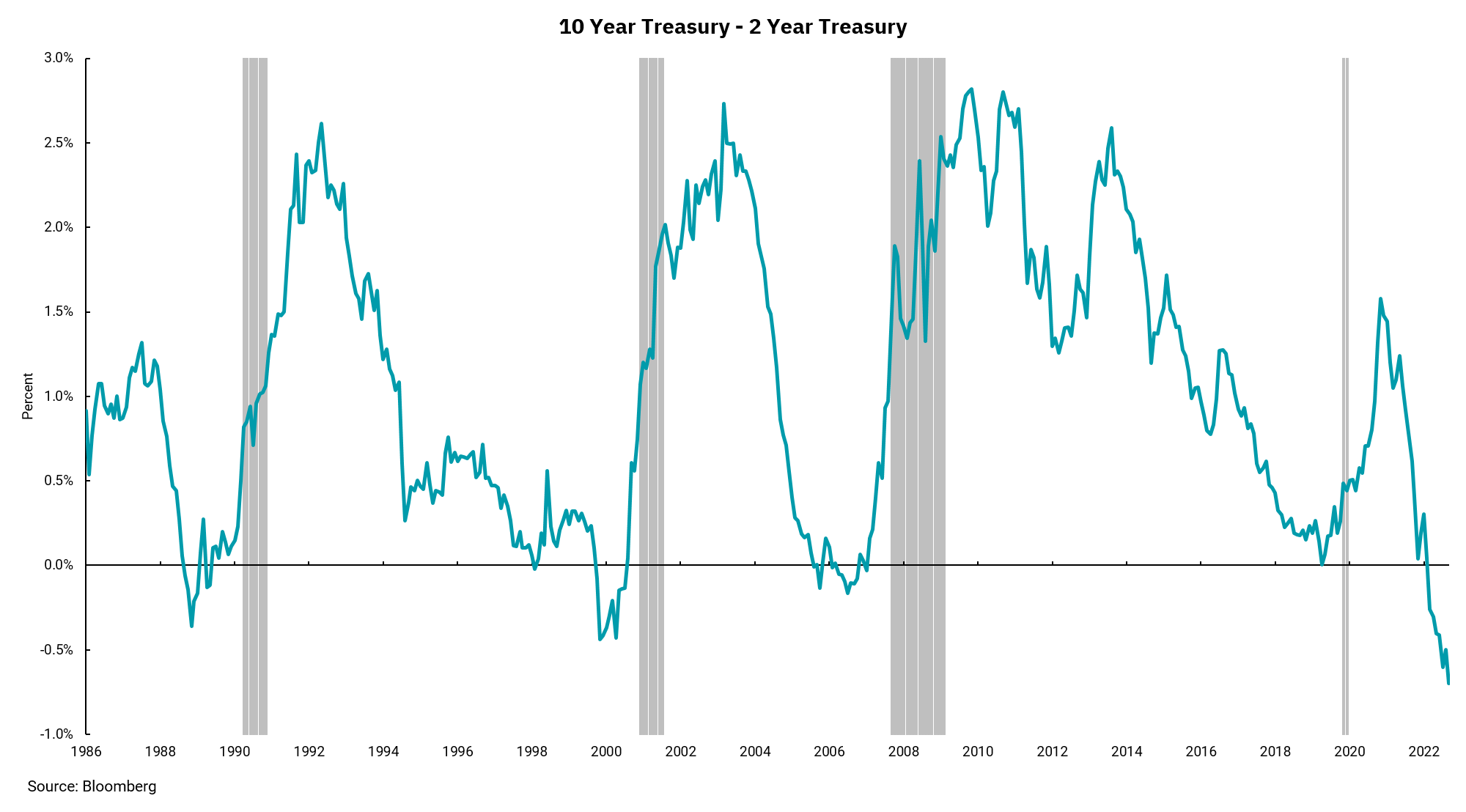
Much has been written about the inversion of the two-year treasury yield to the 10-year treasury yield. A look at our chart shows a couple of reasons why. First, it is unusual. Since 1986 (or any period), the amount of times that two-year notes have yielded more than tens is a short list. Second, past inversions preceded a gray bar on the chart. These gray bars represent economic recessions, so any inversion is worth noting.
Looking more closely, we can see a couple of other items of importance. The current inversion has been in place but has moved to levels much deeper than we have seen since 1986. We have to go back to the late 1970s and early 1980s to see inversions of this magnitude, and those were periods of significant inflationary pressures and economic volatility.
There is another pattern illustrated in the chart, too. Note that the yield curve typically un-inverts BEFORE the onset of the recession that follows the inversion. This might very well mean the potential start of a recession after this inversion could be months away. Overall positive economic data on growth and jobs could support this view.
Past inversions show that, while a recession was not imminent, they have been a strong signal from the bond market that weaker growth was in the offing. The depth of the inversion does not correlate with the depth of the recession, but an inversion of the magnitude and duration of the current one seems to warrant a cautious outlook.
Get By the Numbers delivered to your inbox.
Subscribe (Opens in a new tab)