‘Easy’ declines in inflation are behind us
High prices in housing and other services remain tough nuts to crack
6 min read
It doesn't happen often, but despite the capital markets being closed for Good Friday, an important economic data point was released. Not unlike labor market reports, there are several different inflation readings that provide a bit of a mosaic on inflation. We follow both the Consumer Price Index (CPI) and the Producer Price Index (PPI). Still, when it comes to the measure of inflation most preferred by the Federal Reserve, we are talking about the Personal Consumption Expenditures Price Index, or PCE.
Just like with CPI and PPI, we tend to look most closely at the "core" readings of PCE due to the inherently volatile nature of food and energy prices, both of which are excluded from core inflation readings. That is not to say those prices don't matter, particularly in the case of energy, as longer-lasting changes in energy prices eventually work their way through the "core" parts of inflation, too. Nevertheless, historically the Fed has reacted much more often to higher (and lower) inflation when they have made monetary policy decisions based on overall inflation, including food and energy.
So, what did PCE show us for February? The headline number was up 0.3% versus an estimated 0.4%. That looks good until we see that January's number was revised up to 0.4% from an initial release of up 0.3%. And so, all in all, we can call headline inflation a wash and as expected. On a year-over-year basis, headline PCE is up 2.5%. On the more important core reading, we saw an increase of 0.3%, as expected. However, like the headline number, January's release was revised higher to 0.5% from 0.4%. That’s maybe a skosh higher than expected, although year-over-year was as anticipated at 2.8%. Overall, nothing in these numbers should materially impact the Fed's outlook. Fed Chair Powell is speaking post the release, and we expect his comments to stay down the middle as far as their outlook.
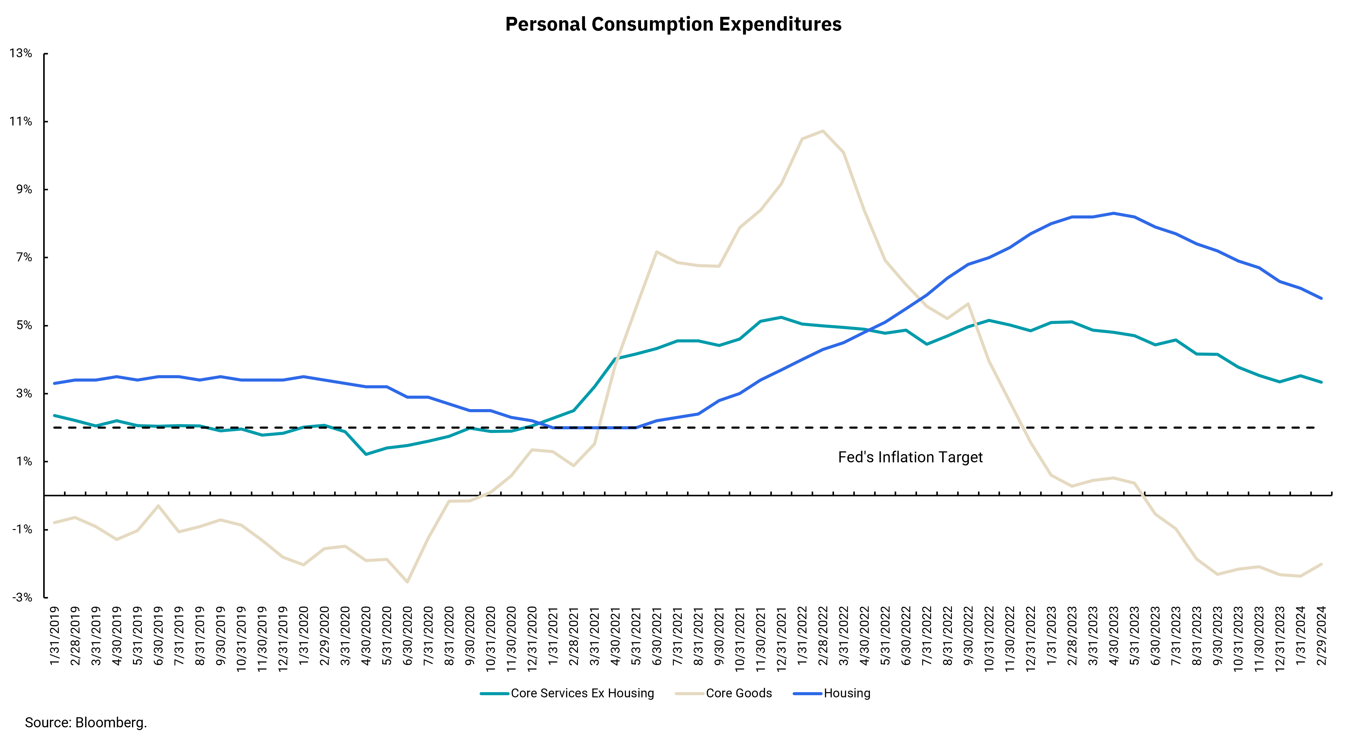
This week's chart breaks the PCE down into some of its components to get a visual of what is happening within the inflation numbers. You may have heard the Fed describe a measure they deemed "super-core" some months ago. Since wages are not measured directly in the inflation data, they look at the "core services excluding housing" as a proxy since wages are the biggest part of the cost structure in that sector. However, our chart shows housing, as it has been a key part of keeping the core inflation readings above the headline for the last few months. The third data point in our chart is "core goods,” and note that our chart goes back to before the pandemic. Doing so reveals the significant changes in inflation across different sectors. We know spending on core goods exploded higher during the pandemic, leading to significantly higher prices. Then, as the economy has re-opened and supply chains heal, we can see core goods are back to a disinflationary environment like the pre-pandemic period.
What has yet to recover are the more secular parts of inflation such as housing and core services. We can see the trends in both continue to improve, but the absolute levels remain above the Fed's target and above the pre-pandemic levels. The easy declines in inflation are behind us; it gets harder from here.
Get By the Numbers delivered to your inbox.
Subscribe (Opens in a new tab)